# load packages
library(tidyverse)   # for data wrangling and visualization
library(tidymodels)  # for modeling
library(usdata)      # for the county_2019 dataset
library(scales)      # for pretty axis labels
library(glue)        # for constructing character strings

# set default theme and larger font size for ggplot2
ggplot2::theme_set(ggplot2::theme_minimal(base_size = 16))SLR: Prediction + model evaluation
STA 210 - Spring 2022
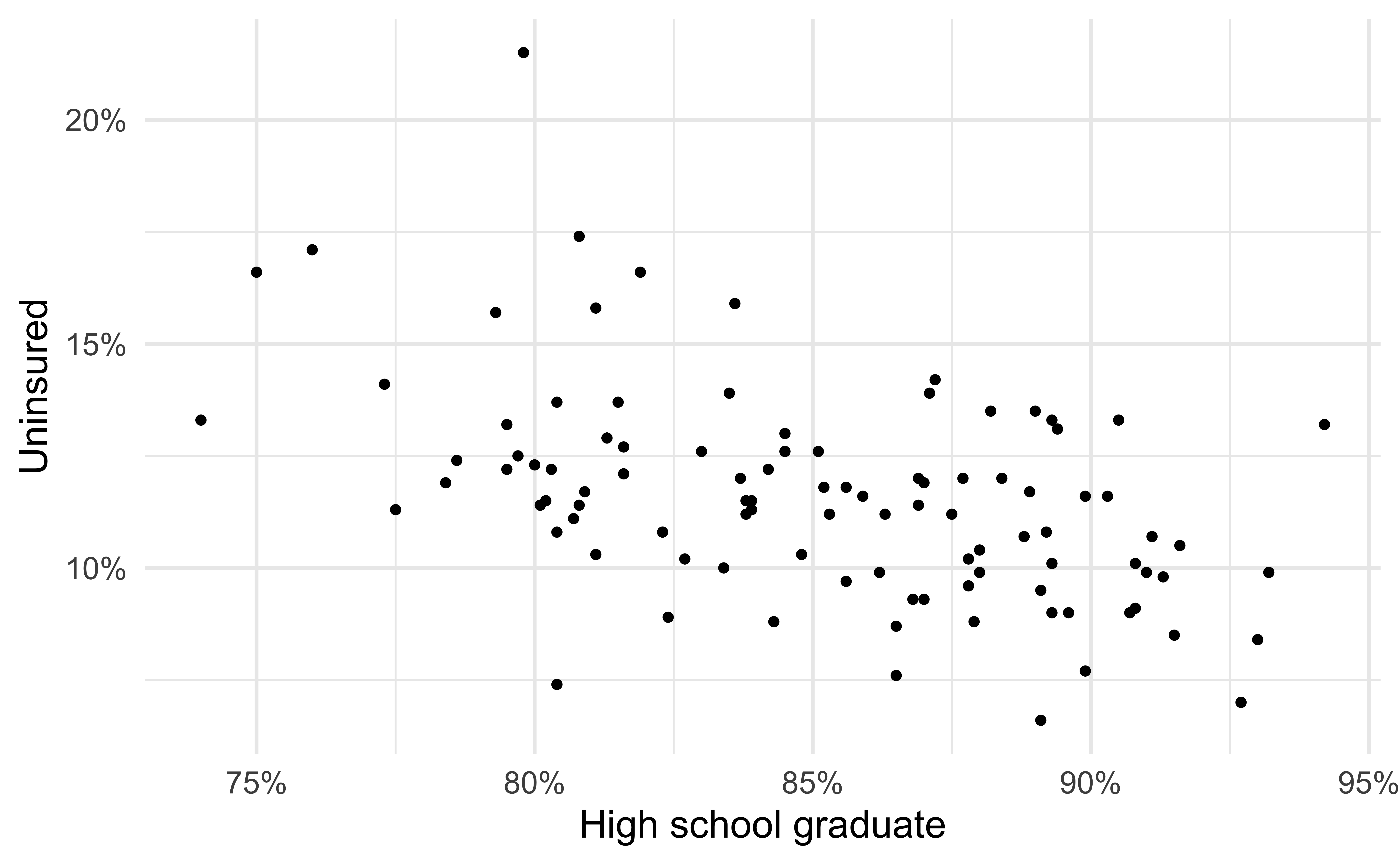
Uninsurance rate
High school graduation rate
Uninsurance vs. HS graduation rates
Code
ggplot(county_2019_nc,
       aes(x = hs_grad, y = uninsured)) +
  geom_point() +
  scale_x_continuous(labels = label_percent(scale = 1, accuracy = 1)) +
  scale_y_continuous(labels = label_percent(scale = 1, accuracy = 1)) +
  labs(
    x = "High school graduate", y = "Uninsured",
    title = "Uninsurance vs. HS graduation rates",
    subtitle = "North Carolina counties, 2015 - 2019"
  ) +
  geom_point(data = county_2019_nc %>% filter(name == "Durham County"), aes(x = hs_grad, y = uninsured), shape = "circle open", color = "#8F2D56", size = 4, stroke = 2) +
  geom_text(data = county_2019_nc %>% filter(name == "Durham County"), aes(x = hs_grad, y = uninsured, label = name), color = "#8F2D56", fontface = "bold", nudge_y = 3, nudge_x = 2)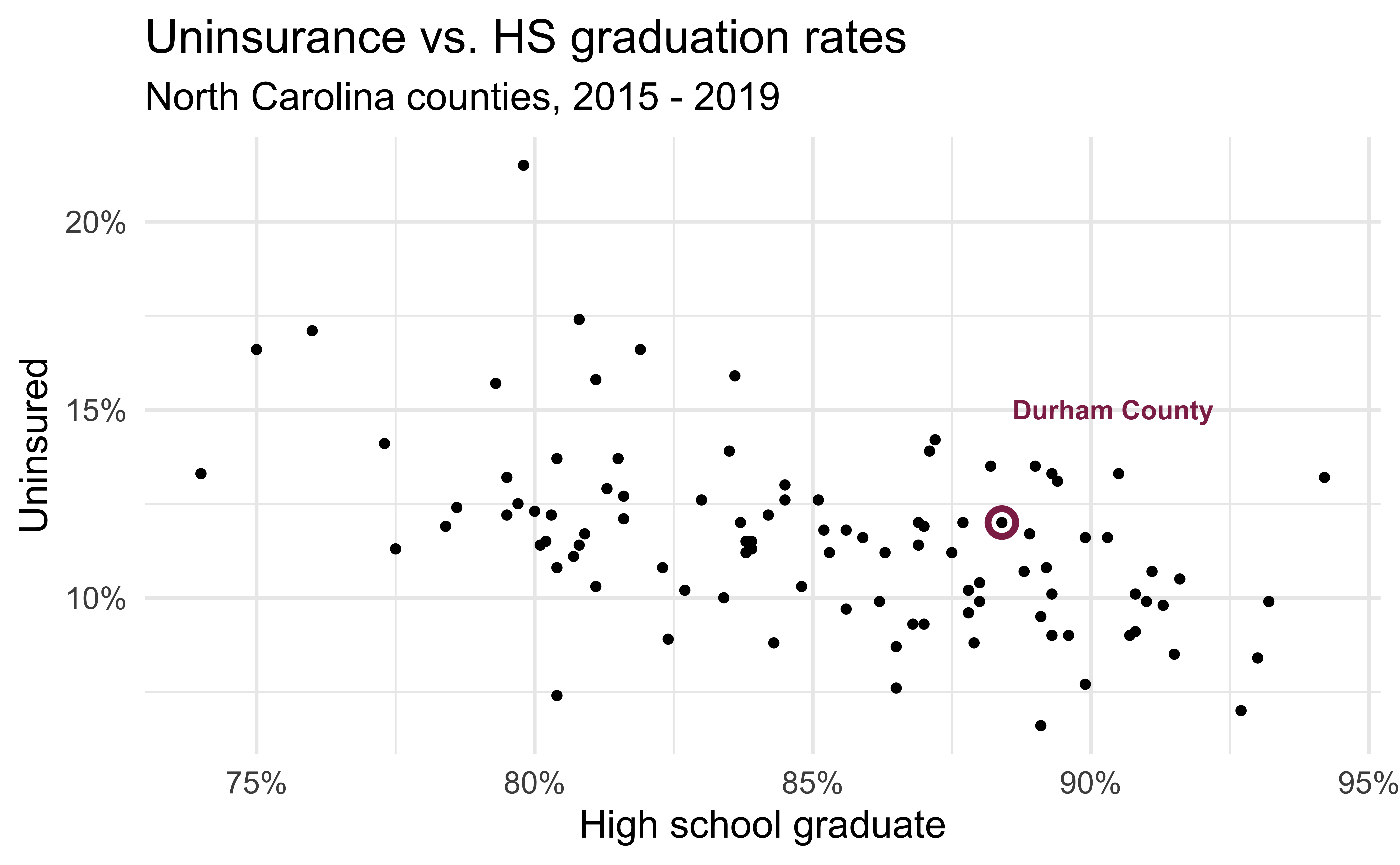
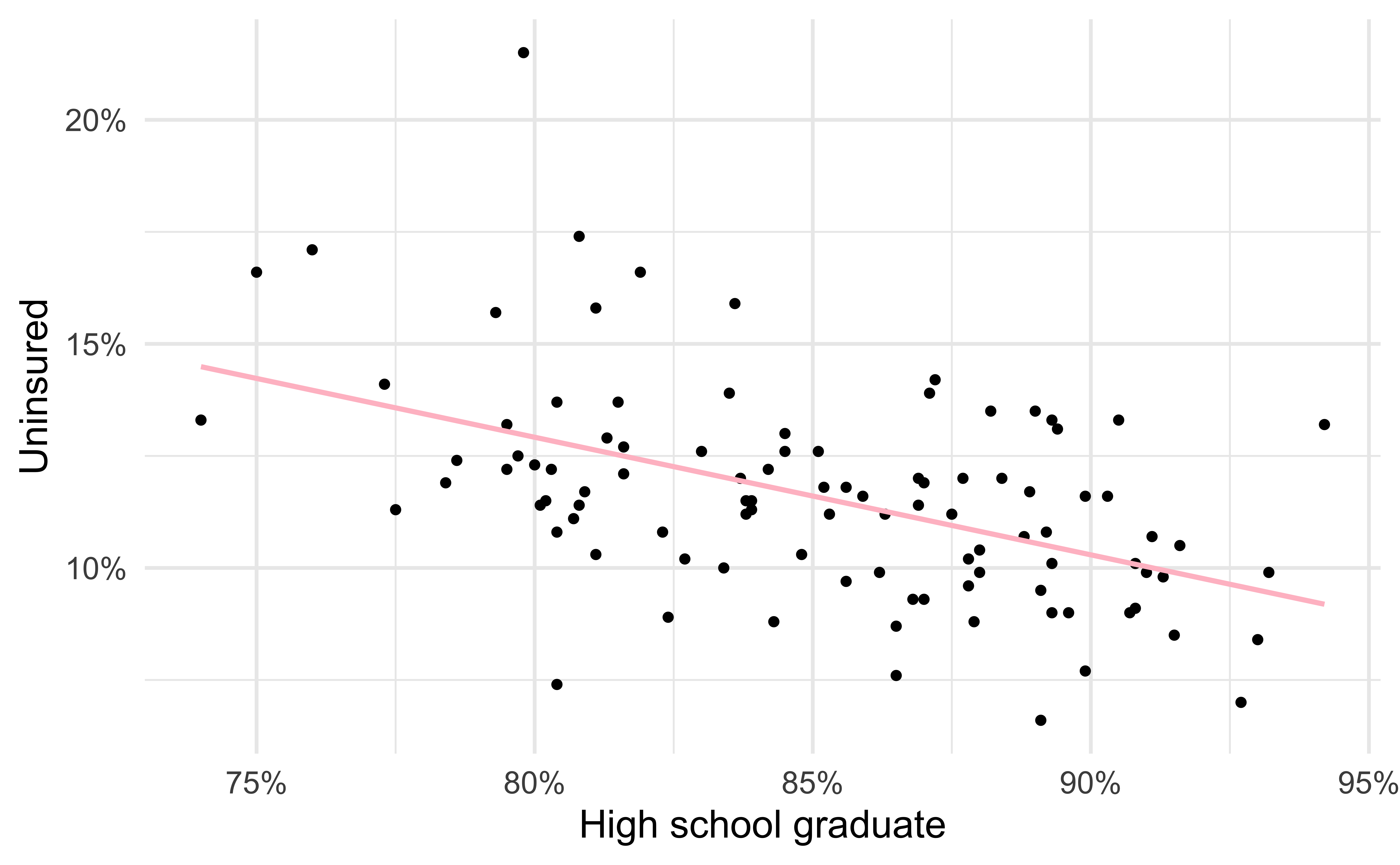
Modeling the relationship
Code
ggplot(county_2019_nc, aes(x = hs_grad, y = uninsured)) +
  geom_point() +
  geom_smooth(method = "lm", se = FALSE, color = "#8F2D56") +
  scale_x_continuous(labels = label_percent(scale = 1, accuracy = 1)) +
  scale_y_continuous(labels = label_percent(scale = 1, accuracy = 1)) +
  labs(
    x = "High school graduate", y = "Uninsured",
    title = "Uninsurance vs. HS graduation rates",
    subtitle = "North Carolina counties, 2015 - 2019"
  )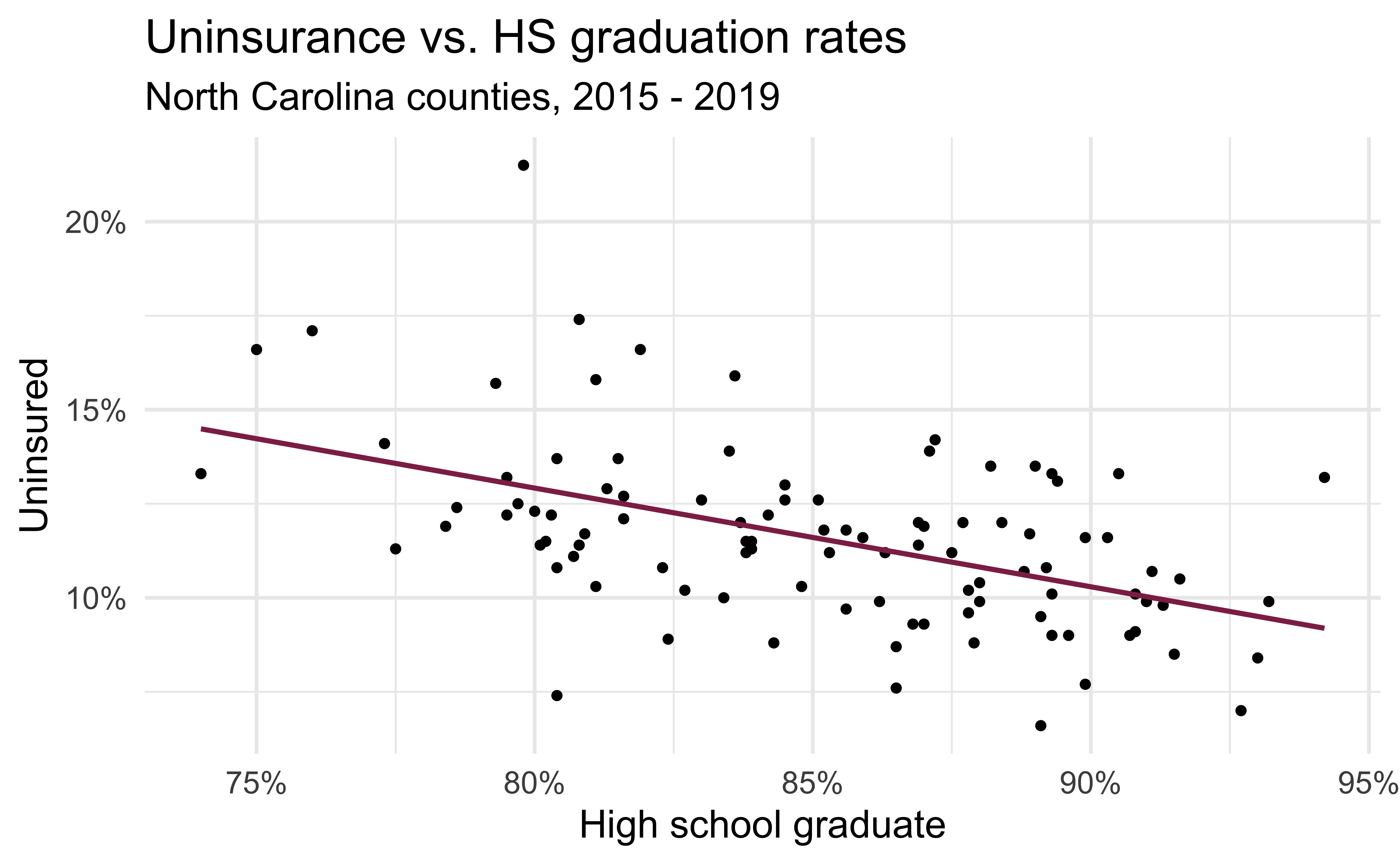
Visualizing the model I
- Black circles: Observed values (
y = uninsured)
Visualizing the model II
- Black circles: Observed values (
y = uninsured) - Pink solid line: Least squares regression line
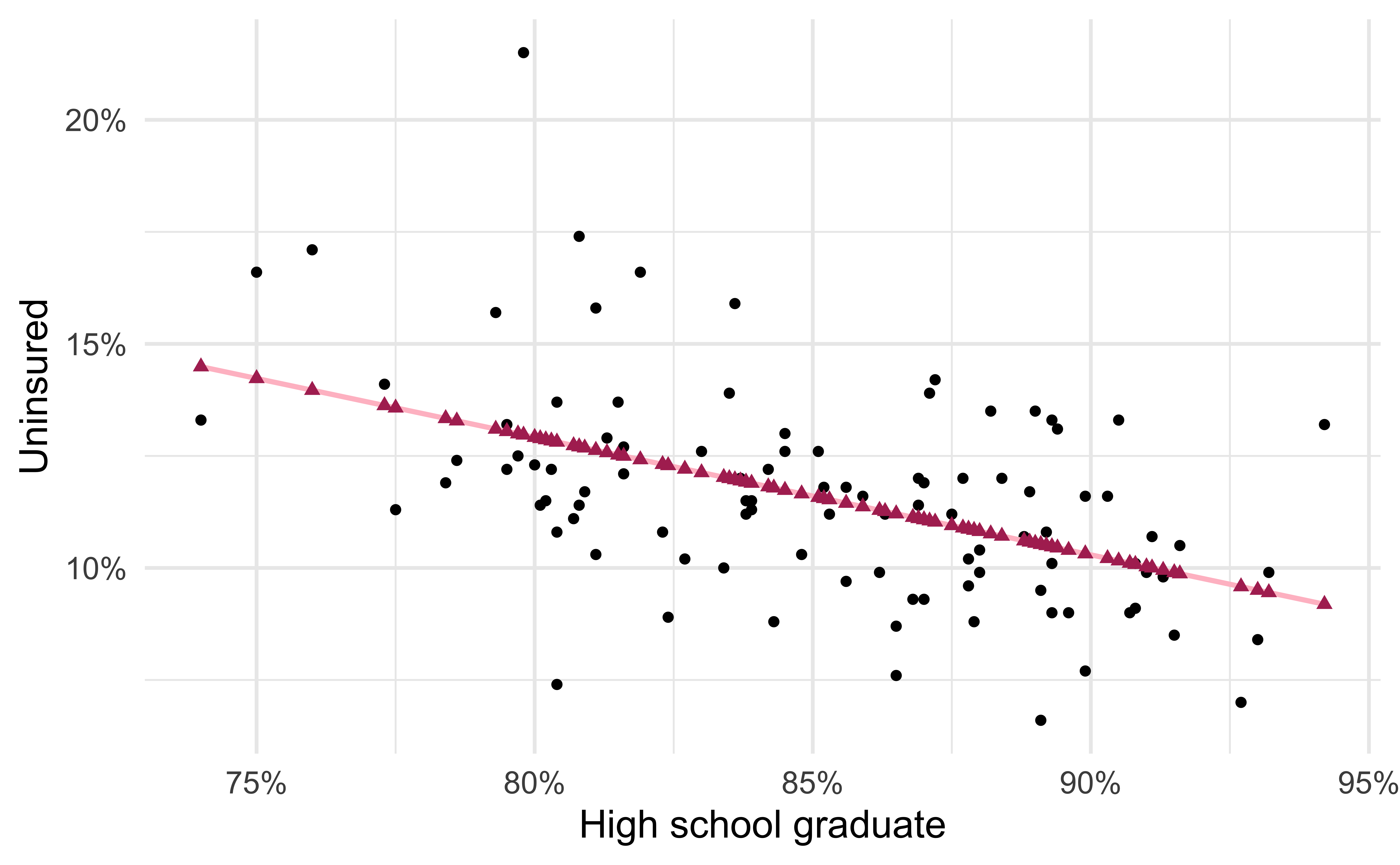
Visualizing the model III
- Black circles: Observed values (
y = uninsured) - Pink solid line: Least squares regression line
- Maroon triangles: Predicted values (
y = .fitted)
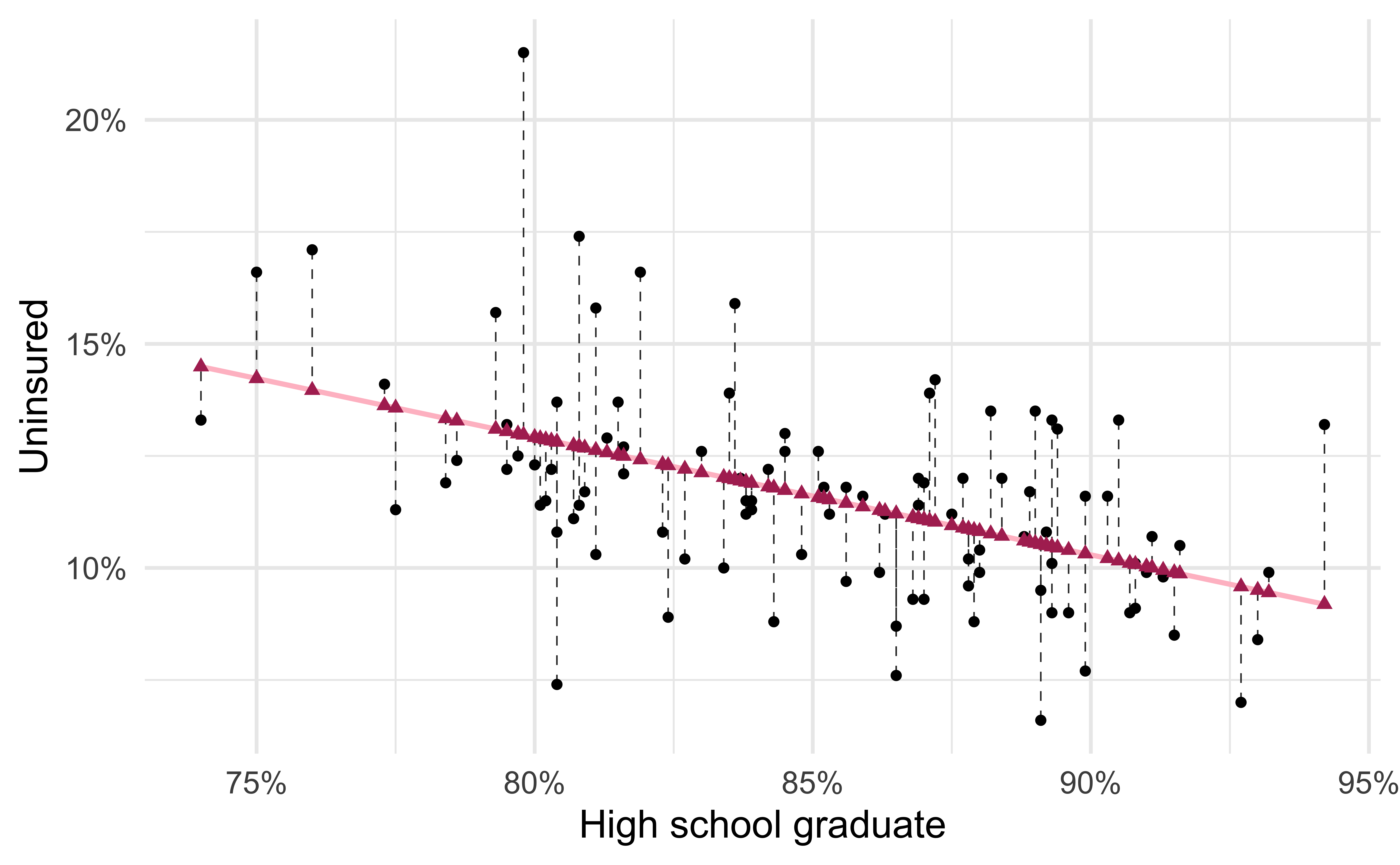
Visualizing the model IV
- Black circles: Observed values (
y = uninsured) - Pink solid line: Least squares regression line
- Maroon triangles: Predicted values (
y = .fitted) - Gray dashed lines: Residuals
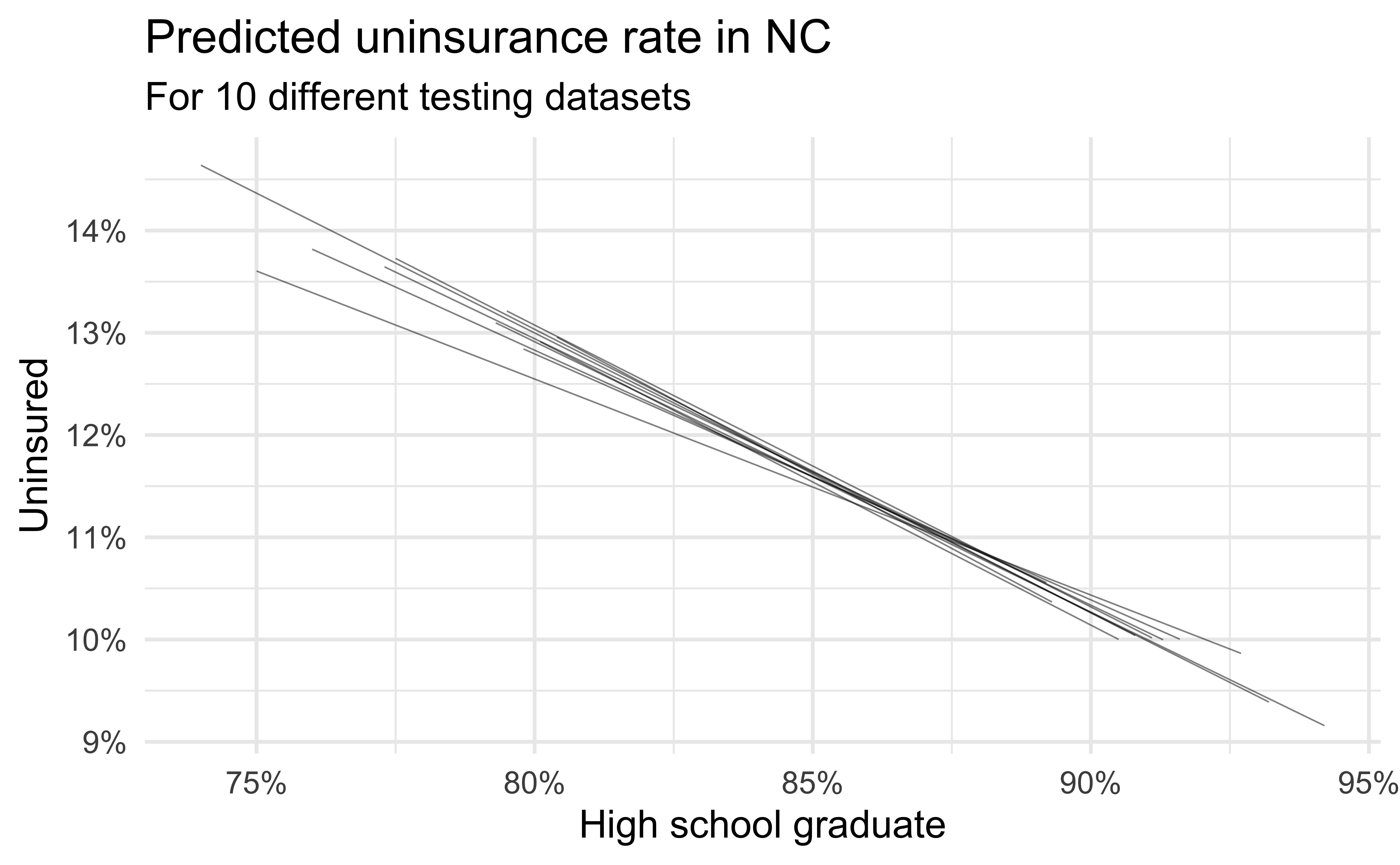
Simulation: data splitting
- Take a random sample of 10% of the data and set aside (testing data)
- Fit a model on the remaining 90% of the data (training data)
- Use the coefficients from this model to make predictions for the testing data
- Repeat 10 times

Predictive performance
- How consistent are the predictions for different testing datasets?
- How consistent are the predictions for counties with high school graduation rates in the middle of the plot vs. in the edges?
Simulation: bootstrapping
- Take a bootstrap sample – sample with replacement from the original data, same size as the original data
- Fit model to the sample and make predictions for that sample
- Repeat many times
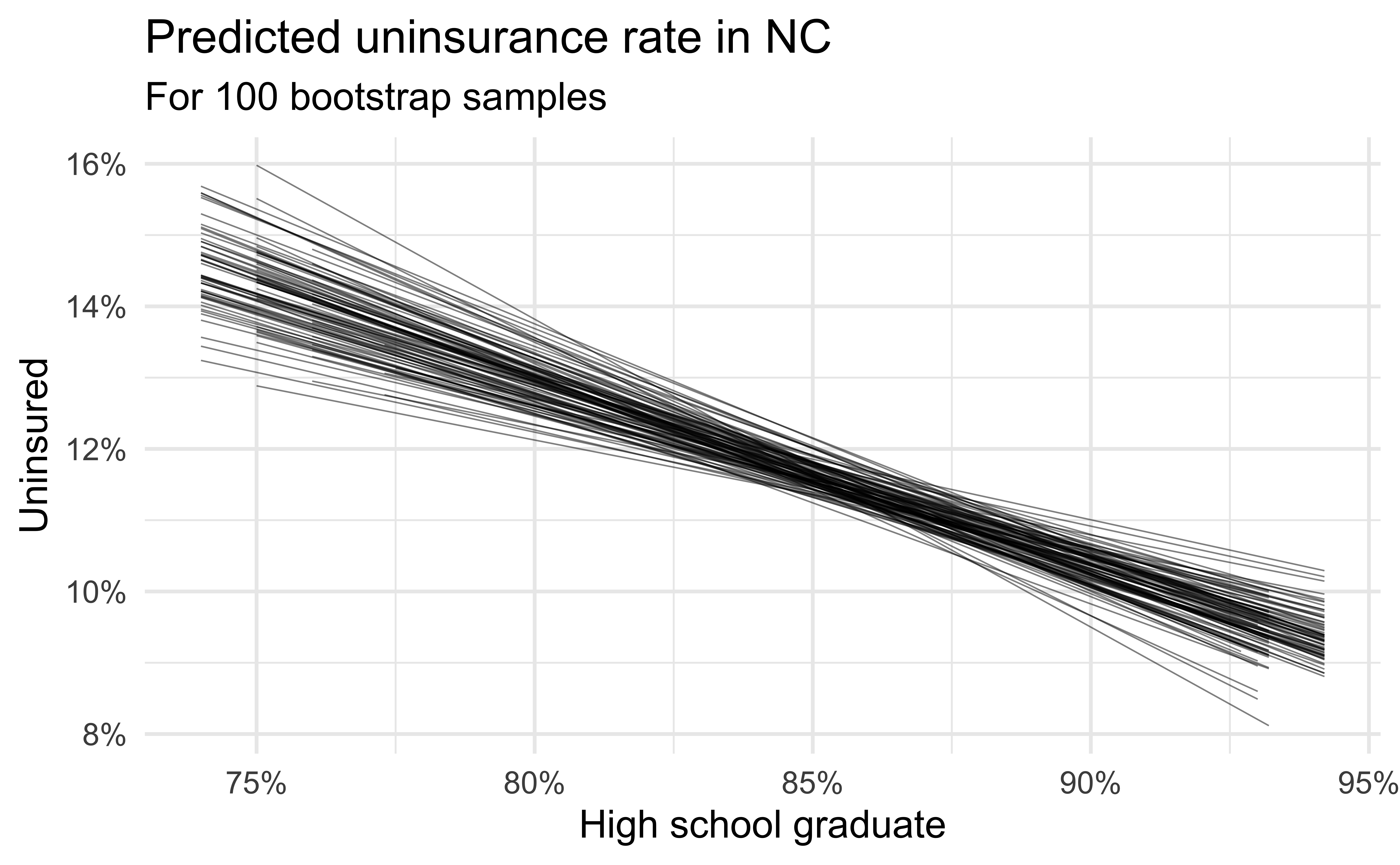
Predictive performance
- How consistent are the predictions for different bootstrap datasets?
- How consistent are the predictions for counties with high school graduation rates in the middle of the plot vs. in the edges?

![]()